Every year Pantone, the color people, come out with a color of the year. This announcement generally sends designers, stylists and other artsy interior folk into a frenzy with comments and opinions (some positive and some not so positive). Pantone makes this announcement in December. Well, in the last few years, many other color oriented industries have jumped on the bandwagon and have taken to announcing their own colors of the year. Yesterday I received an announcement in my inbox that Sherwin Williams announced their color of the year for 2017 already! For the last several years Pantone has chosen some bold colors. If Sherwin Williams is any indication, maybe the pendulum is swinging back in the other direction? Their color of the year is …. Poised Taupe….
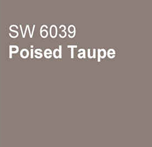
Ok, so the name isn’t doing them any favors. BUT, I think for those looking for some color inspiration in their home, Poised Taupe is actually a pretty good starting point. It’s a good neutral base that can pair well with whites, darks and even more bold colors. Of course Sherwin Williams has recommended color pairings, but I’ve created a few of my own.
Mixed with greens and a highlight of eggplant can create a regal or even a garden feel.

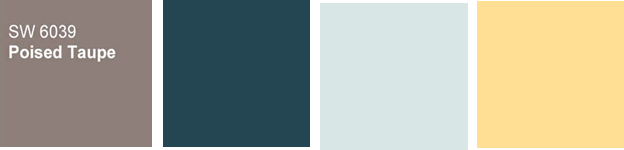
When paired with a deep blue, crystalline blue and yellow highlights this could be a fun pallet for a beach house.
The incorporation of bold coral with softer sage and light taupey-grey would be a fantastic color set for a traditional design.