New Year, New HGTV Dream Home

HGTV’s 2018 Dream Home

It wouldn’t be the start of a new year without a review of the highs and lows of the HGTV Dream Home.  The unveiling of the 2018 HGTV Dream Home was just one small thing to look forward to the night before everyone trudged back to work and school today.  As with the last several years of Dream Homes this one was also a renovation rather than a complete new build, because ya know, who can resist a stunning before and after?  I was particularly excited by this year’s contemporary style since it’s a similar style to my home that we’ve been slowly remodeling over the last few months.
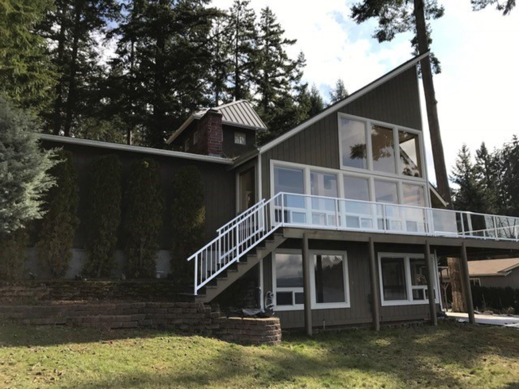
Before, Exterior

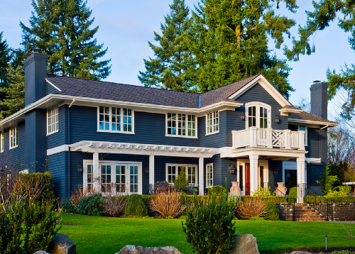
The HGTV 2018 Dream Home is located in the Pacific Northwest, right along the Puget Sound.  The setting is gorgeous.  The previous exterior, not so much.  Let me rephrase, it wasn’t awful, just a bit outdated and weird.  What’s up with that asymmetrical ship’s watch?  My guess would be that similar to our home, this one was originally built in the mid-80’s.

dream home exterior

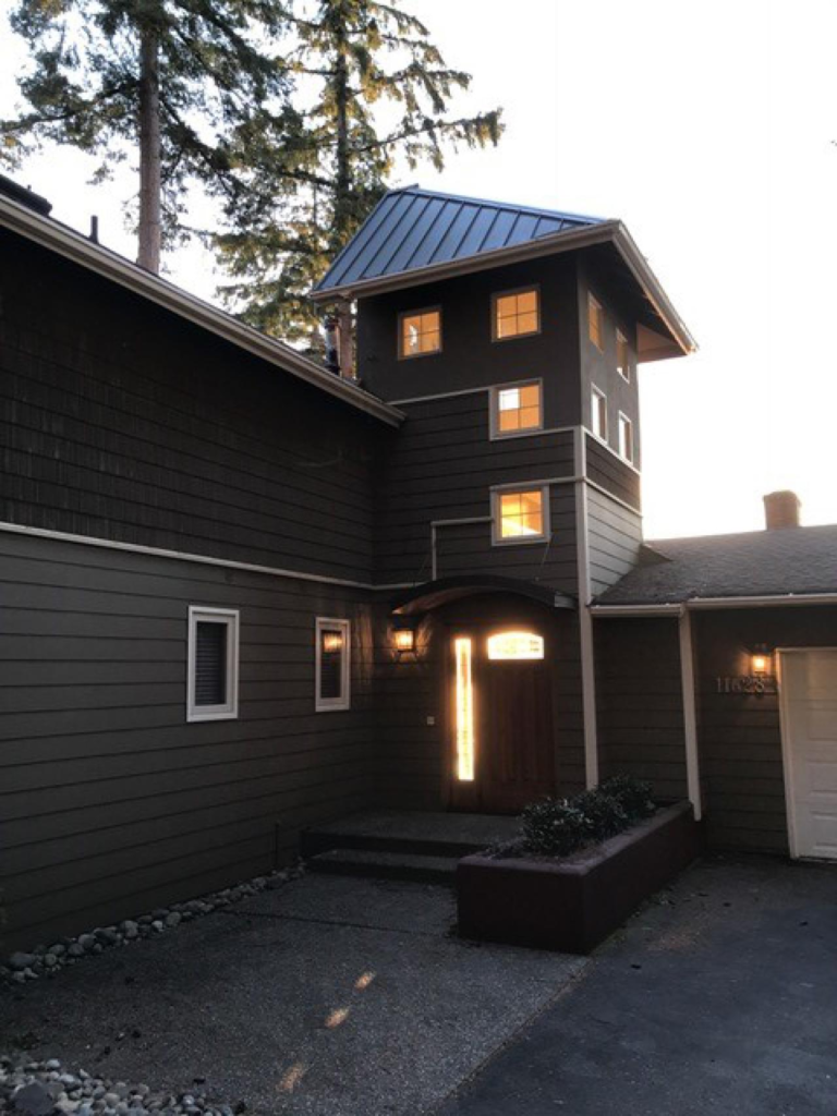
The back of the home looks slightly better, but all you see if building block looking windows, stark white railing, and too-big arborvitae bushes hiding the wall.
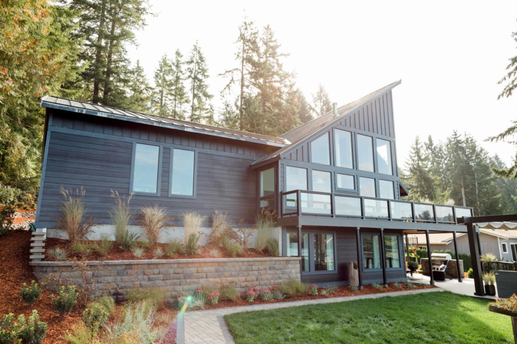
exterior before

After, Exterior

The after is much improved, sleek and truly contemporary.  None of that “I am a contemporary but would rather be coastal” that it previously possessed.  The metal roof over the entire home probably cost a pretty penny (I’ve been researching them as a possibility for my own home) but makes such a difference.  Removing that ship’s watch was also a great choice and the updated driveway, garage doors and landscaping don’t hurt either.

after exterior dream home

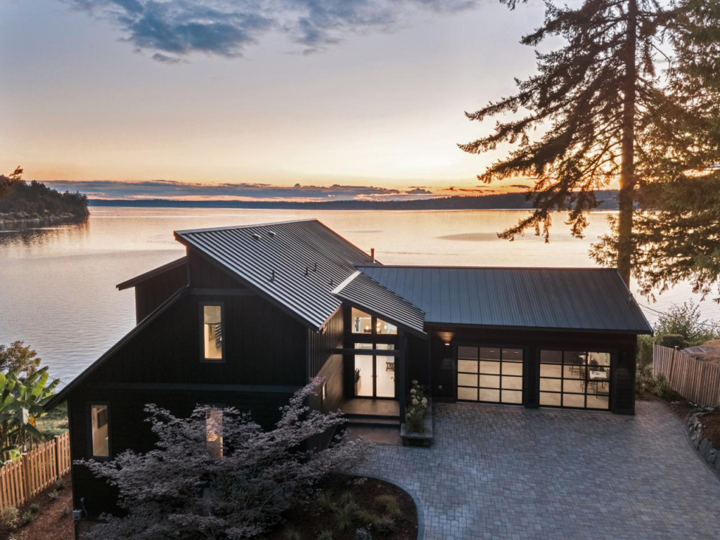
This home is just reaffirming many of the contemporary design choices we’re making for our own home, and the black modern windows and dark painted exterior help immensely.  I wish HGTV would name all of their products somewhere and the cost for the product and the installation and construction. I’ve found that black (interior and exterior) windows are not as readily available as one might think, and when you can find slick black contemporary windows, they are $$$$!

black windows

Dream Home Interior

I won’t bore you with all of the choppy wrong-ness of the before interiors, you can check them out for yourself on HGTV’s website but I did want to take you through some of my favorite parts of the completed interior.

Ok, here the view says it all, and perhaps that’s why they chose not to go with black interiors on the windows here but rather white with white trim? The millwork is simple and contemporary and honestly fades away unless you’re really looking for it, making the Puget Sound views the main event.

great room

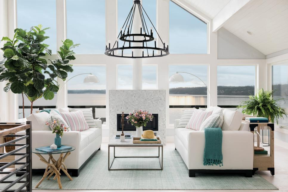
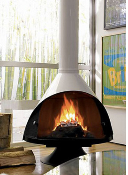
I’m torn about the fireplace placement.  On one hand it’s ideal to have your great room furniture be focused on both the fireplace and the views all at once, but a fireplace of this size does take up a good portion of that view.  And while the look of this one is very coastal, I’d have gone with something a bit more contemporary that didn’t take up so much real estate, like this one here by Malm.

suspended fireplace

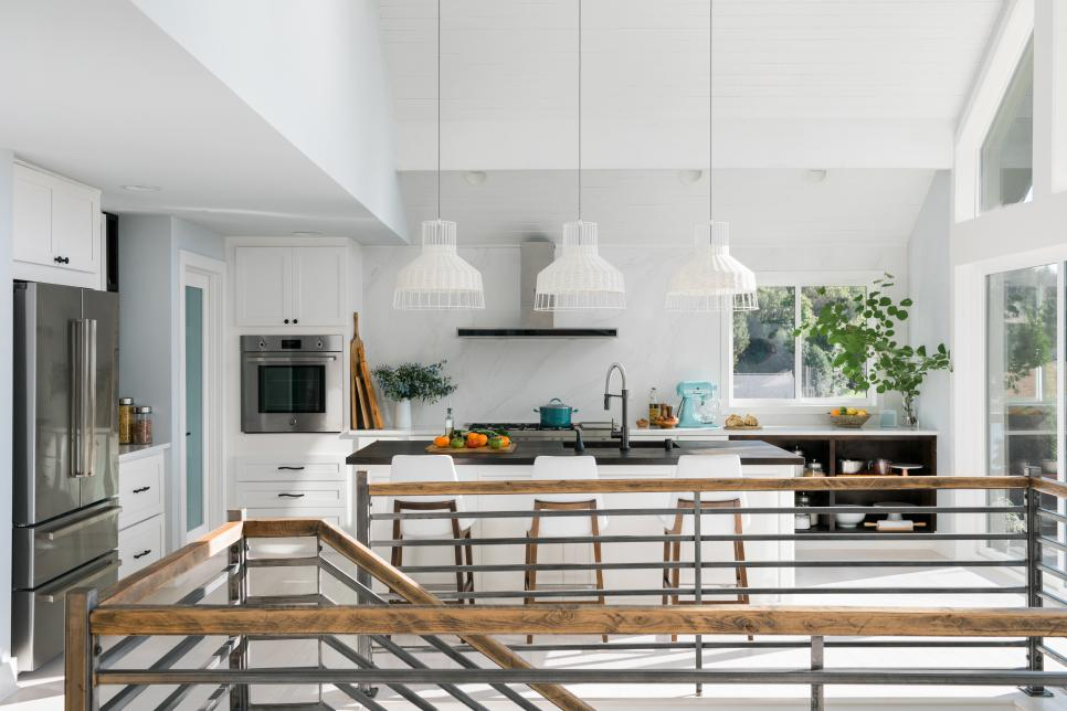
I am still a sucker for a white kitchen, and I really love that they are using a shaker cabinet in a contemporary home.  (More positive design affirmations for my home – yay)! The metal and wood railing are perfect and add the modern edge while the white wicker pendants over the island give it just enough coastal kitsch.  I may need to pick up these counter stools for my own home.

kitchen modern coastal

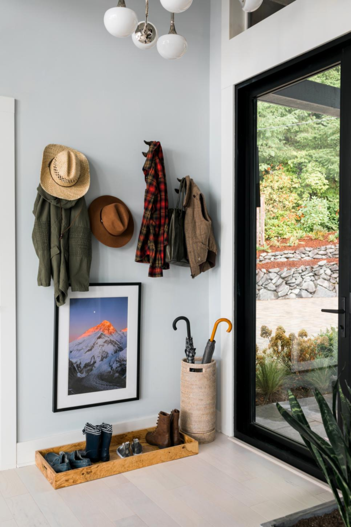
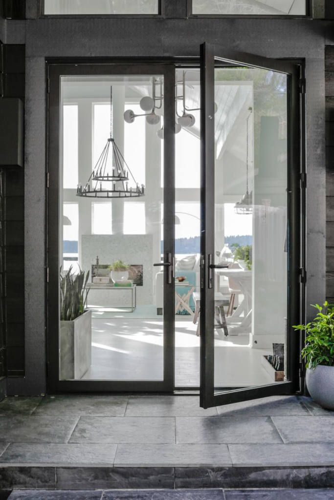
This entry door is perfection.  You can see in the second pic below it’s a very modern black interior/exterior French door.  I am hoping that this is what our new Marvin Contemporary door will look like in our in-progress kitchen. It’s harder to find modern looking French doors without mullions than you think.  They are not a standard off the shelf Home Depot purchase, trust me.  I’m a bit disappointed by the random hooks just hung on the wall with no framing or bench.  The hooks themselves are adorable whale tails but I wish this wall had been framed out (maybe with some board and batten) so that the coats weren’t the focus. The art is gorgeous though hung at a weird spot, probably to detract your eye from random coats.  And the idea of a burled wood boot tray in the Pacific Northwest is a smart and good-looking idea.

contemporary doors

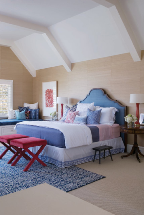
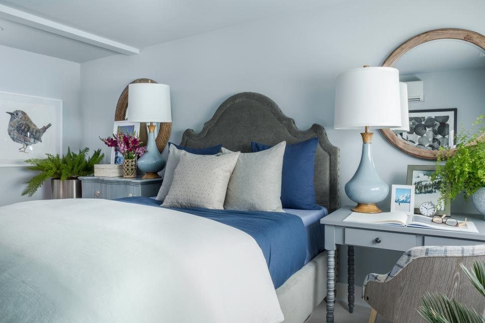
In my opinion this is the best bedroom of the bunch.  The blues are calming, but not boring, and this is a great example of how things don’t need to be perfectly matchy-matchy but can still “go.”  See how those mirrors are similar but not the same, and the desk and dresser, too?  I also like how larger furnishings are used as nightstands.  Lots of folks don’t have room for a bed, nightstands and a desk and dresser in their room.  So it makes perfect sense to replace some of the less utilitarian pieces with those that can do double duty.

blue grey bedroom

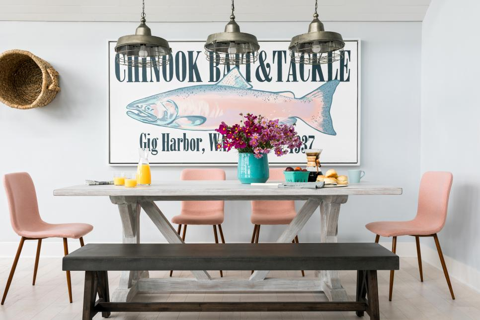
There are so many things I like about this vignette even though I don’t love pink.  I adore large scale art.  I love this fish sign and it fits this house outside Seattle perfectly.  My other faves here are mixing dining chars with a bench, the mismatched table and bench and  the pendant trifecta.  There is so much interest and mixing of styles here that you don’t even really miss an area rug under the table… ok maybe I miss one just a little…

large art

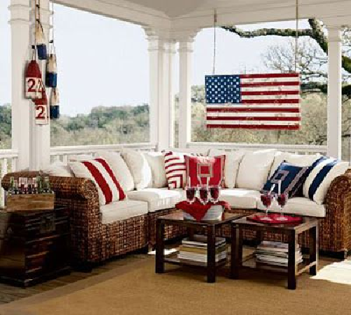
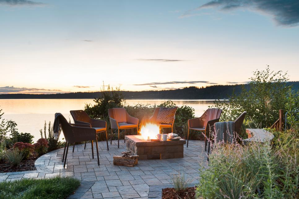
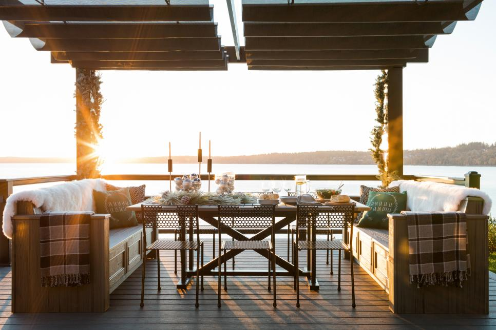
Finally, the outdoors.  The view from this property is just amazing.  And while it may rain a ton in the Pacific Northwest, for those times when it is nice enough to be outside, it helps when it looks like this space.  Who wouldn’t want to snuggle up next to that fire pit or have a meal with family and friends at that outdoor table?

Outdoor Entertaining Spaces

hgtv dream home

hgtv dream home

And HGTV, if you’re reading, here’s what I really wanna know:

1) How much does everything cost? Like regular retail cost that your everyday person would pay?

2) How much time does it take Ryan Patrick Flynn to design all these spaces?  How large is his team?

3) Next year can you create a list where everything came from. I mean everything.  Shingles, doors, windows, counters, light fixtures, a duvet, everything.  Not just those that pay sponsorship.  It doesn’t have to be emblazoned anywhere, just a list, no logos, no ads.

4) How much did you pay for the fixer initially?  How much did you put into it (labor and materials)?  What’s it worth now?

What were your favorite parts of the 2018 HGTV Dream Home?  What do you want to know about the HGTV Dream Home?  Lemme know in the comments, maybe we could get a petition going 😉

DIY Minecraft Mural

But first a house update…

Still a whirlwind here at my new home the construction site.  Over the past weeks we had electricians moving several electrical panels from various places across the home to the garage.  While this wasn’t an absolute necessity, we believe that it will pay off in the long run for two reasons.  First, it will allow all wiring to be run in the basement in one new soffit right alongside the HVAC ducts.  Previously the wires were a spaghetti mess above the drop ceiling in the basement, but since the basement ceiling is currently pulled out it made sense fix it properly now.  Second, it means we can remove both non-code compliant electrical “closets” that had been fashioned to hide the previous panels in the family room.  While they technically did their job at hiding the panels, they were not aesthetically pleasing to look at and seriously messed with the flow and looks of the rooms.

Other new developments include our receipt of a proposal to remove both loadbearing and non-loadbearing walls so we can rework the floorplan on the home’s main level.  More to come on that soon!  In the interim more deconstruction continues in the basement including continued removal of wood paneling, drop ceiling and carpet.  Dead mouse count is up to 56! In addition to the removal of the walls, we’ve consulted with a plumber to talk about how to untangle the spaghetti of Pex plumbing that used to be in the basement drop ceiling, removal of the old wet bar drain, and how to ready the new kitchen area for plumbing including a gas line for the range (I’m hoping there is budget for a big professional grade range).

DIY Minecraft Mural

I really wish we were further along than we currently are.  Renovation always seems to be so much simpler and quicker in your mind than what reality dictates.  HGTV makes it look so easy! I could maybe get a bit more done on our home reno if I wasn’t so busy with design projects for my business, but this is a problem I can’t complain about!  Here’s a recent project that I wanted to share.  I recently did a custom geometric mural painting for a client’s new home.  Their son is a huge Minecraft fanatic.  Rather than pick one paint color for his bedroom, I proposed 12 colors! That’s right, TWELVE, that take the shape of that tell-tale Minecraft cube pattern.  All 12 colors were in the shades of green and brown and when finished have the look of Minecraft dirt and grass.  The great thing about this geometric mural is that it could be done in a variety of colors depending on what your child likes most about the game.  Shades of grey for rock, grey and black and spots of red for spider, shades of blue for water, you get the idea.  It’s actually pretty easy to recreate with a little patience, skilled use of a level and lots, scratch that, TONS of painter’s tape.

Materials

Here are all the materials I used:

  1. 12 quarts of Benjamin Moore paint in the following colors:
  • 554  Easter Hunt
  • 406  Huntingdon Green
  • 417  Feel the Energy
  • 558  Killala Green
  • 553  Richmond Green
  • 546  Courtyard Green
  • 1596  Nightfall
  • 455  Sweet Basil
  • HC 68  Middlebury Brown
  • 1057  Maple Valley
  • 1055  Algonquian Trail
  • 1029  Coconut Grove
  1. A yardstick, and a tape measure
  2. A long (3-4 foot) level (if your wall is smaller you might be able to get by with a laser level, but I’ve always found they get more inaccurate the longer your wall)
  3. About 6 rolls of painter’s tape
  4. Pencils and erasers
  5. One 1.5” paintbrush per color plus 1 or 2 small detail brushes
  6. Drop cloths, paper towels, rags, etc.

How-to DIY Minecraft Wall

First, I needed to determine how many squares I could fit across and vertically on the wall so that I didn’t end up with partial blocks on any edge.  To start with, I knew that I wanted large-ish blocks that were about 12 x 12 inches each.  So I took the overall length and height of the wall and divided by different figures until I ended up with something that was evenly divisible in both directions.  In this case it meant blocks that were about 13 x 13. Is there likely a mathematical proportional equation that could have figured this out the “right” way, sure probably, but this way just seemed logical in my head, so that’s what I did.

DIY minecraft wall before
Start with a boring white wall.


Once I knew how large each block would be I took my yardstick and measured every 13 inches along the bottom of the wall and made a small pencil tick mark.  I did the same thing going up the left and right sides and along the top.  Then, I took my level and made intermediate horizontal tick marks 1/3 up the wall and 2/3 up the wall.  Next, I used the level to connect the dots to make a perfectly straight grid pattern both horizontally and vertically.  Everyone knows homes’ walls are never perfectly straight, so every now and then I’d step back to make sure it looked about right.

measure minecraft wall cubes
Carefully measure, level, and mark with pencil lines


Next, it was time to tape.  I began with taping on the ceiling, baseboards and the adjoining walls first since those pieces of tape will stay put for the entire project.  Then I began taping on the left edge of each vertical line and on the top edge of each horizontal line. Because of where you have to tape, at any given point you can only paint a quarter of the wall’s squares. Starting off because the squares looked so similar (everything white with blue painter’s tape) I placed some blue tape “x’s” on the squares I should NOT paint so I could keep track.  In the current formation I painted every other bottom square, every other square on the 3rd row, 5th row, and so on.  I didn’t use a specific pattern for where to put what colors, but had a few rules I followed to keep it looking like true Minecraft. I kept the bottom 2 rows completely brown.  The third row from the baseboard was a mix of brown and green and the rest of the cubes above that third row were green.  I never put the same exact color directly adjacent to itself.  The same color diagonally was acceptable.

tape minecraft mural
Tape off the squares and mark a few so you know which ones NOT to paint.


Add 2 coats


After my first coat was dry I went back and gave a 2nd coat to those squares then removed the tape.  I used a brush to do all of this painting for a few reasons.  Brushes, while they required a slower and more methodical stroke, minimized bleeding under the tape.  Also, utilizing 12 different mini rollers and pans could get expensive and unwieldy. Every time I finished with a brush, I’d return it to its own plastic bag to keep the paint moist.  Hint: If you have a painting project that will take more than 1 day place your brush or roller in a plastic bag, seal it, then put it in the fridge overnight.  Only do this with latex paints.  Other more odious products can ruin food.  Believe me, I know firsthand.

DIY minecraft
Paint as many as you can before needing to remove tape and re-tape


Once the first set of cubes was completely dry, I re-taped on the opposite edges and painted the isolated squares with 2 coats, then removed tape, let dry, and re-taped.  I repeated this process until all squares were completely painted.  Inevitably there were some areas where either the paint bled under tape or the tape overlapped too much leaving white to shine through.  I had to go back and touch up these areas with a small detail brush.  Finally, I removed all the border tape along the ceiling and baseboards, and voila, Minecraft wall accomplished!  This project took about 2.5 days to complete.  It helps to be able to ventilate the room with fresh air provided it’s not humid or raining outside and a fan to help speed up the drying time between tapings.

minecraft wall DIY
Remove tape and then re-tape in next area.


Getting closer – be patient! Ensure that same colors aren’t adjacent.


My Minecraft fan hadn’t fully moved in yet, but once his room is complete I hope to be able to share the entire look here! Here is the finished wall:

complete minecraft wall
The finished product – adds dimension and interest.


completed minecraft mural
The perfect wall of Minecraft cubes!


Save

Save

Save

Three Cheers for the Red, White and Blue

The colors of old glory, perfect in their patriotism and symbolism of the US of A, yet colors that are often poorly designed and styled.  Frequently this patriotic color combo is avoided altogether because, let’s face it, nobody wants their house to look it came straight out of a 1980’s issue of Country Living or like Grandma’s reproduction Amish quilt.  Doing red, white, and blue right can be hard, but it CAN be done.  With some patience and a discerning eye the colors of the USA can be great in a nautical look, a playful kids vibe, a rustic farmhouse look, or a more traditional style. Here are a few examples of red, white and blue styled rooms that look oh, so perfect!

Nautical

Here’s a modern nautical bedroom from County Living.  Before looking at the room you might think that striped bedding AND striped wallpaper would be overdoing it, right?  Nope, in here with the simple metal bedframes and lots of bright light it all works.  I particularly love the curtains that are each different large scale nautical flags!

nautical red white and blue bedroom

Farmhouse

This farmhouse cottagey look DOES utilize an Amish looking quilt, but it’s styled so perfectly with the warm white walls and pops of strong red (not a washed out red that would look too country) in the nightstand and vase of poppies.  The jute rug adds a natural, neutral element that grounds the entire space.  Photo via pinterest.

farmhouse red white and blue


Traditional

This traditional space featured on B.A.S. is a relatively small space with tall ceilings.  The designer here went crazy with mixing patterns, BUT it’s visually supported by so much neutral and white that it totally works.  It doesn’t look cheesy Americana or anything, just a fun version of traditional, and it totally works.

traditional red white and blue


Another traditional space, this one by Andrea Schumacher, mixes soft blues, bold reds and tones it all down with neutral grasscloth wallpaper.

traditional bedroom red white blue


Exterior

This classic color combo works on home exteriors as well just like this one here by Andrea Braund.


And certainly, if there is any place where you can get away with a little bit of patriotic kitsch, it’s the front porch, since it’s almost more like holiday decorating than permanent decorating.  This one, which I think is a several years old styling by Pottery Barn, still looks classic and cute.

patriotic porch

Have a fun Memorial Day weekend and please take a moment to remember all those who have died in service to our nation and have given so much to keep us free!

Perfect Beachy Paint Colors

Picking perfect paint colors can be so hard.  You have to consider furnishings, light, room structure, setting, environment and the feeling you want to evoke.  At the beach we probably want to feel relaxed, refreshed, or maybe even energized and invigorated.  These are some of my favorite beachy paint colors.  In addition to walls and decor, at the beach we can take a bit more risk and go bold on a kitchen island, a dresser or a bathroom tile.

Here’s my selection of go-to beachy hues in soft relaxing tones and bold seaside inspired colors.

Perfect colors for a beach house
Go-to Beachy Paint Colors


What are your favorite shore inspired colors?


Pantone Color of the Year 2017 – Greenery

Every year in December, Pantone, THE color people, name a color of the year for the upcoming new year.  They announced their new color, Greenery, last Thursday.  I truly had it in my head for the last several days, thinking about this color, that I was going to talk about how much I hated it.   BUT, as I built the collection of goods for this blog post, it actually started to grow on me.  My initial reaction was that this shade should be reserved for granny smith apples and maybe a wicker set in a Florida room in Boca Raton.  I do think it would be better with more yellow, leaning toward a chartreuse hue, but that said, I think Greenery does have some redeeming qualities and could add a nice punch to an interior when used judiciously.  You won’t find me painting any walls this color, but when used in small amounts, with warm neutrals and lots of white, it could be just the pop your room needs.   Here’s a few household items in Greenery -like – tints that work.  I’m particularly loving the wallpaper options (#1 & 11).  Either of them  would make a boring powder room bright and happy. What do you think about Pantone’s Color for 2017?  How would you use it in your home?

pantone-2017-greenery


  1. Tahiti Scenic Ashford Tropics – Ashford House Wallpaper  $28
  2. Jill Rosenwald Chain Reversible Duvet Cover  $52
  3. Alanya Ottoman  $298
  4. Kosta Boda Contrast Vase in Lime  $89
  5. KitchenAid ® Artisan Green Apple Stand Mixer  $329
  6. Besa Lighting Cierro Satin Nickel One-Light Mini Pendant with Chartreuse Glass  $189
  7. 10 Strawberry Street Nova Square Banquet 45-Piece Dinnerware Set  $59
  8. Sarah Sleeper Sofa  $1200
  9. Green Garden Stool  $99
  10. SINNLIG Scented candle in glass, Crisp apple  $2
  11. Banana Leaf Ashford Tropics – Ashford House Wallpaper  $29


Color me…. taupe?

Every year Pantone, the color people, come out with a color of the year.  This announcement generally sends designers, stylists and other artsy interior folk into a frenzy with comments and opinions (some positive and some not so positive).  Pantone makes this announcement in December.  Well, in the last few years, many other color oriented industries have jumped on the bandwagon and have taken to announcing their own colors of the year.  Yesterday I received an announcement in my inbox that Sherwin Williams announced their color of the year for 2017 already!  For the last several years Pantone has chosen some bold colors.  If Sherwin Williams is any indication, maybe the pendulum is swinging back in the other direction?  Their color of the year is …. Poised Taupe….

Poised Taupe


Ok, so the name isn’t doing them any favors.  BUT, I think for those looking for some color inspiration in their home, Poised Taupe is actually a pretty good starting point.  It’s a good neutral base that can pair well with whites, darks and even more bold colors.  Of course Sherwin Williams has recommended color pairings, but I’ve created a few of my own.

Mixed with greens and a highlight of eggplant can create a regal or even a garden feel.

Paint 1


When paired with a deep blue, crystalline blue and yellow highlights this could be a fun pallet for a beach house.

Paint 2


The incorporation of bold coral with softer sage and light taupey-grey would be a fantastic color set for a traditional design.

Paint 3